With that in mind, we've made it even easier for you to use Google Analytics to create clear and effective management dashboards without having to extract data into other programs. You can use the rich Google Analytics UI and present your promotion-worthy numbers in all their vibrant glory by clearly visualizing trends in weekly or monthly units, in addition to day by day. Have fun with this feature! Watch the patterns come into focus.
Let's look at how the weekly and monthly graphing views can be used by comparing them with viewing the data by day, which used to be the only option. It's very interesting to open up one or two years worth of data to look at your site over time. (Click on the images below for larger views.)
Graph by Day

Strategic insights come from analyzing long term trends. This is the default view in Google Analytics. It hints at something interesting going on in terms of Visits on your site.
New: Graph by Week Try this cool thing. Click on the Week link on top of the graph, it is newly available in your reports! Suddenly it is more clear what the trend in Visits is. Cooler!
New: Graph by Month
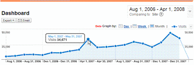 Click on Month and you are now really cooking. Months and months of data visually represented in a way that allows you to clearly show a positive trend, highlight the key points, and yes even ask for a bonus.
Of course all other visualization features in Google Analytics are even more useful now as you use these new time buckets. For instance, take a look at the compare to past visualization.
Comparison in Day view
 Comparing two different time periods is a great way to get context to your current performance...
New: Comparison by Month ...but you can highlight the trends in your performance much more optimally by simply clicking on the Month link. This works great for your management reporting and moves you into that corner office. :-)
No comments:
Post a Comment